Overview
Dipp’d is a —self created/proposed— donut shop located in Toronto that specializes in creative flavours catering to all ages. Having already established a physical store presence, they aim to reach a larger audience through an online platform for easier access to pickup and delivery. To meet the needs of our assumed client, an art direction and brand strategy was developed for the creation of an expressive yet functional ecommerce site.
Research Gatherings
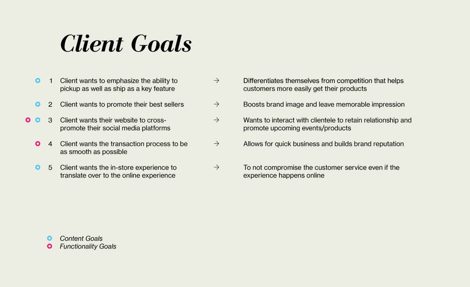
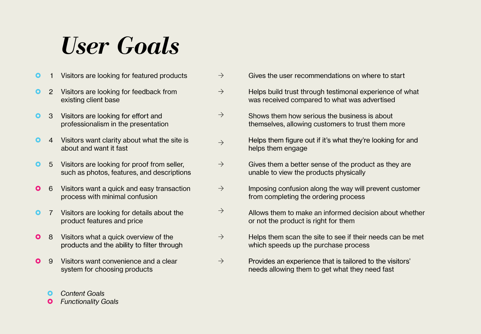
In order to frame our approach for our client, the team first began by conducting analysis on existing ecommerce sites and local competitors. Through a series of company investigations and user interviews spanning a variety of ages (20–60), a set of client and user goals were developed for the brand.
Brand Iteration
Following the team’s research process, it was decided that client would promote a fun and lighthearted identity so that the brand could be approachable for a variety of users. The name of “Dipp’d” was established as a result of this decision, as it served to be a reflection of its playful and lively nature. With the brand background set, the next steps laid in fleshing out the art direction that would represent Dipp’d.
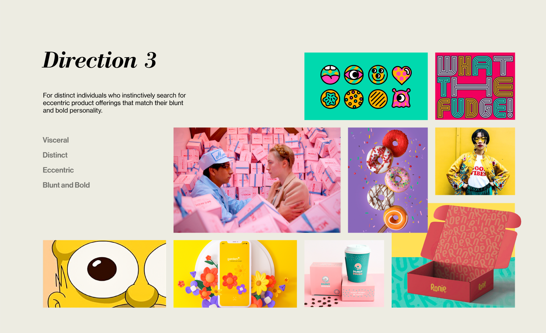
Through a series of image and copywriting groupings, 3 distinct directions were made and represented on a set of moodboards. While each option provided an intriguing possibility to present Dipp’d, the final direction was chosen as the team believed it presented the greatest opportunities for exploration and expression.
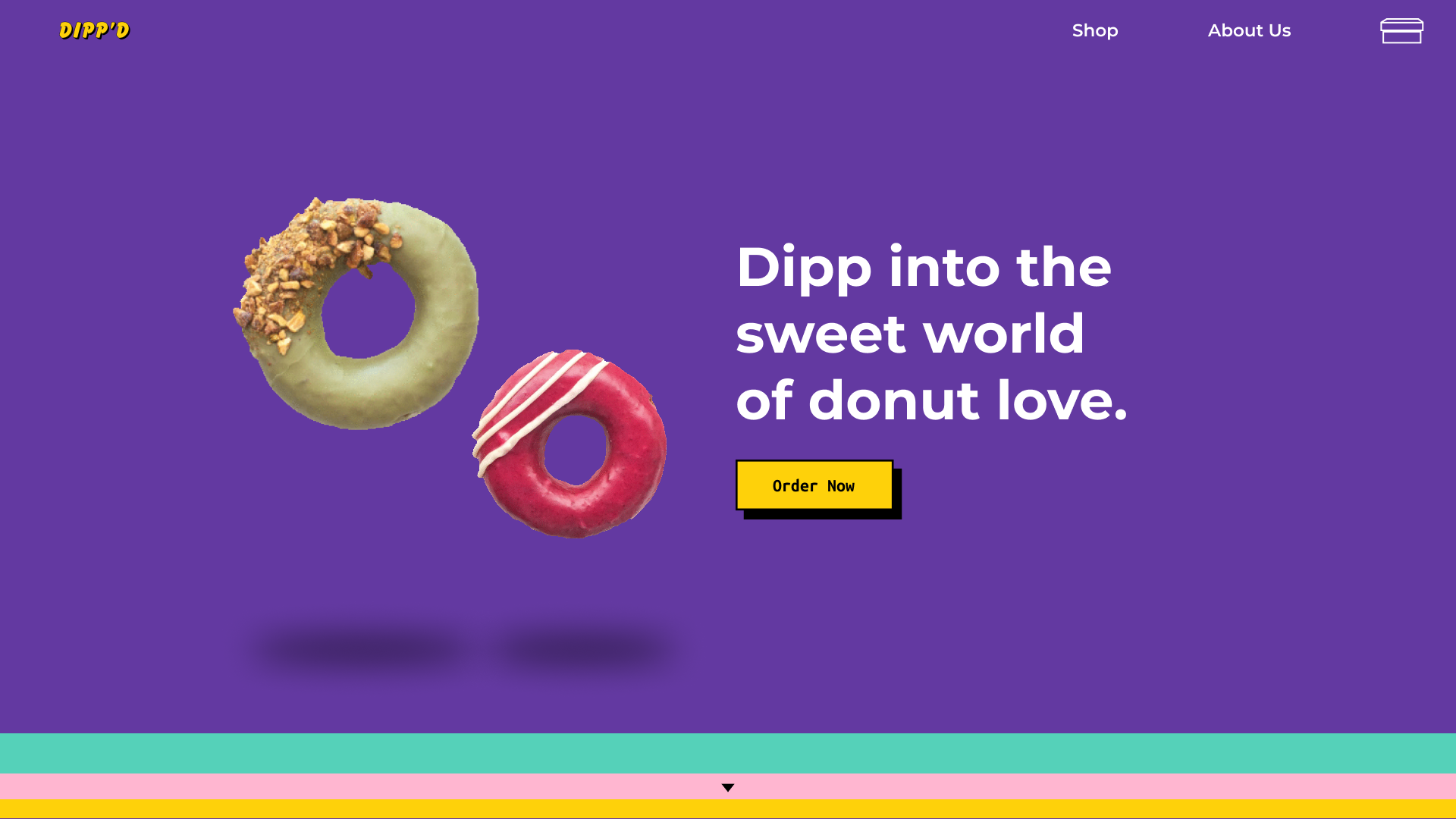
Final Direction
Developing the Design
With the scope defined, we then moved on to implementing the art direction through a series of greybox and high-fidelity wireframes. As the visual form took shape, choices in typography, colour, and interactive elements were documented to create a style guide that would define the structure of Dipp’d. While we progressed through different iterations, the form manifested as pain points arose namely in the application of colour. This was due in large part to the team’s relative newness in this aspect of design, so a focus was placed on understanding different colour combinations.
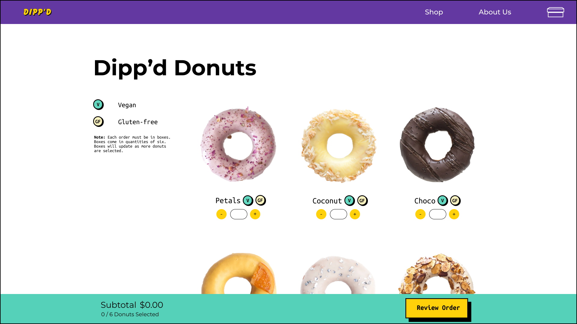
First Iteration (Shop Page)
While the white background was intended to highlight the donuts themselves, it’s application was awkward as there was nothing to anchor it down
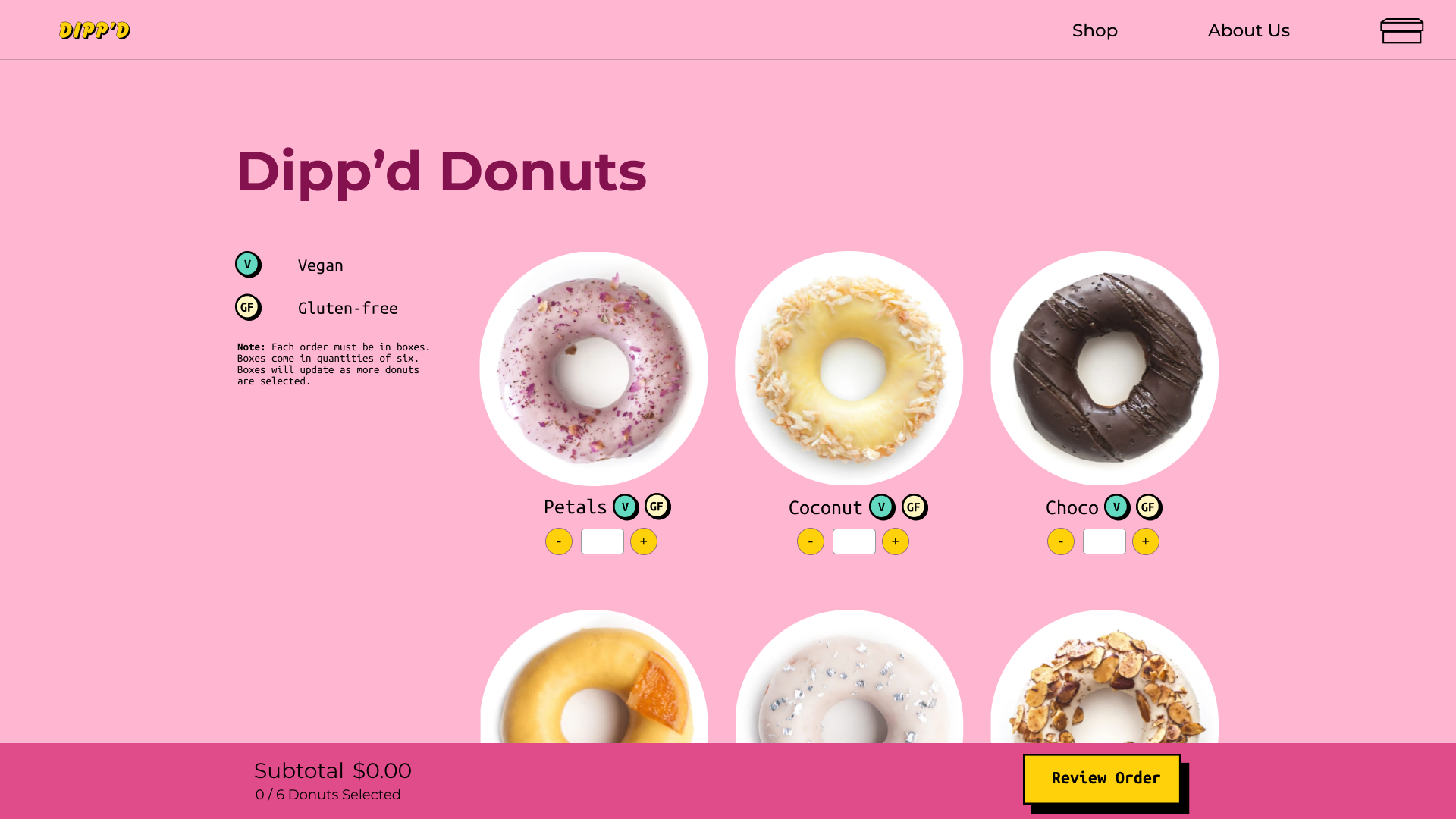
Final Iteration (Shop Page)
Maintaining the intention of having a white backsplash for the donuts, the page now uses a monochromatic palette that supplements the negative space while expressing Dipp’d’s fun nature
Implementing the Design
Marking the transition from designers to developers, our first job came in the creation of a responsive pattern library; our blueprint for the web. Following this and a series of lessons and tutorials, the team underwent a transformation process to become a well-oiled dev team that could churn out code for a responsive web experience. The key goal in our implementations was to provide a user experience supported by our research.
In order to tackle the large scope of the website, roles were delegated as I was responsible for creating copy for the shop page, and developing the checkout and references page along with its respective microinteractions. On top of forming these pages, I helped to achieve more seamless interactions involving the main nav bar as it minimizes when scrolling (to increase screen space when browsing), and switches to a dropdown when it enters a mobile state.
Loading Colours
Users are introduced to the site's colour system through the loading animation when they land (teal= information, pink=shopping pages and yellow=CTA buttons)
Social Media Carousel
Customer testimonials are presented through a draggable carousel that helps to build trust between the user and the brand/website
Shop Interactions
Image, name and dietary restrictions are presented upfront with additional details being revealed on hover allowing users to quickly understand the product and add/remove donuts from their box
Checkout Interactions
Dropdown allows users to choose time of delivery/pickup as input field placeholder text below will retract once users interact with it ensuring that they always know what they need to input. Note: example is zoomed in
Full Demo (Mobile + Desktop)
Below is the full walkthrough of the the Dipp'd site for both mobile and desktop versions. Click me for the live site!
My Final Thoughts
From starting off as a designer concerned with the placement of each px, to becoming the role of a developer calculating the number of rems needed, this project was an invaluable learning experience for what it means to be a front-end developer. On top of gaining a newfound respect for the craft itself, I now understand the process of translating ideas to code; sleek and slick designs are cool, but we have to make sure it’s feasible.
Being able to dive deep into CSS and JavaScript was also a surprising joy and eye opening experience, as I never knew that these were the tools developers needed to create what we designers invisioned. These are powerful tools, and working with both helped solidify the idea that understanding contexts beyond my own domain can not only help myself, but those around me as well.
To finish up, I want to thank both David and Joanna for being along for the entire process. Learning to better ourselves as designers (especially in using colour) and struggle as coders was rewarding, and I am happy that we were able to do it together.