Overview
Ventura Future was a cultural institution that held curated events to showcase the latest developments in contemporary design. Placing an emphasis to promote new and motivated designers, this event was hosted every year as part of Milan’s annual design week. With this institution as our client for this project, our team was tasked with creating graphic and digital assets that would be used throughout the event.
Analysis of Dan Friedman
Before beginning on both graphic and digital assets, the team first began with a deep dive on a precedent designer in Dan Friedman for inspiration. Through a thorough investigation of his works and philosophy as a Radical Modernist, 4 key design principles were extracted that we would use as motivation for our own work. Click me for the presentation!
4 Key Principles
01
Use of Combination Grids
02
Energy created through Scale and Orientation
03
Reversible Figure Ground Motifs
04
Varying use of Typographic Alignment
Graphical Assets Implementation
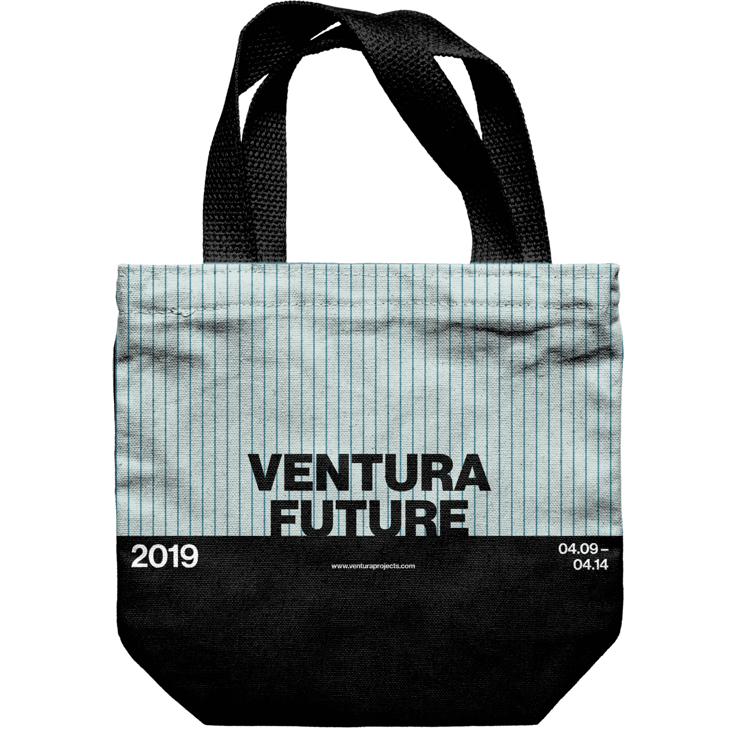
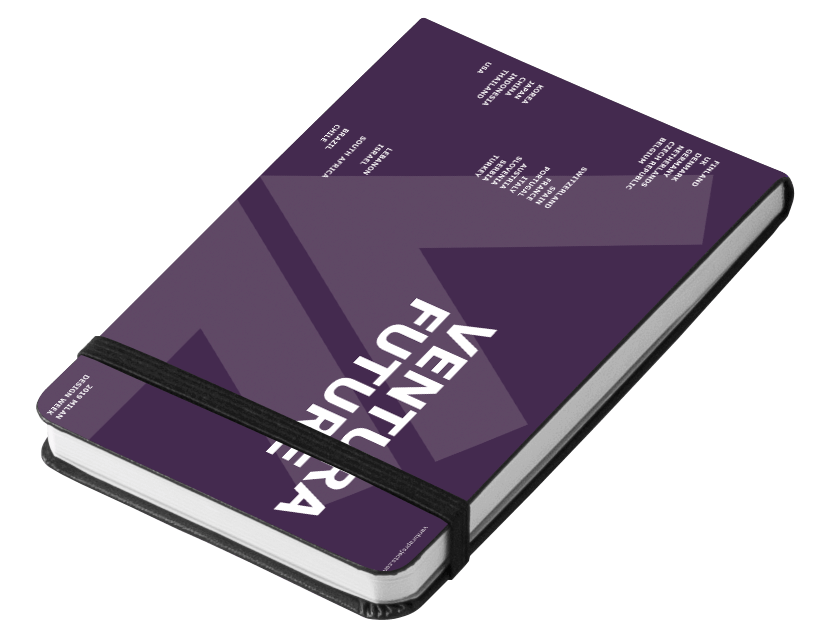
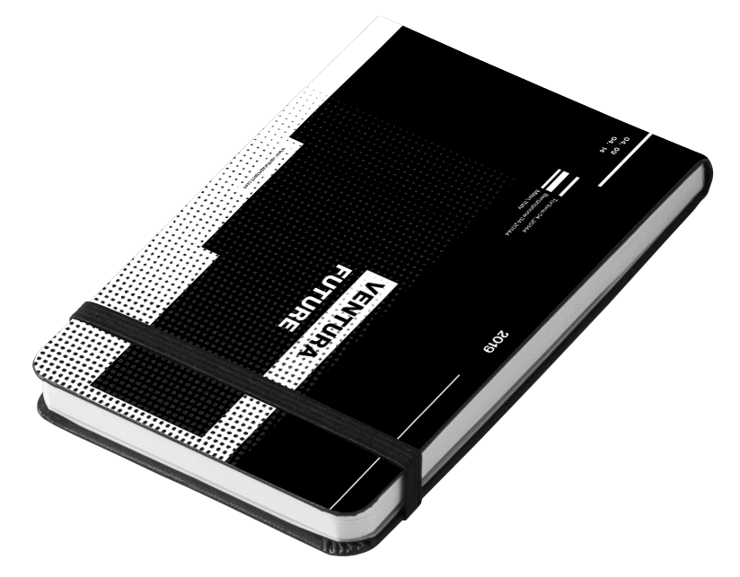
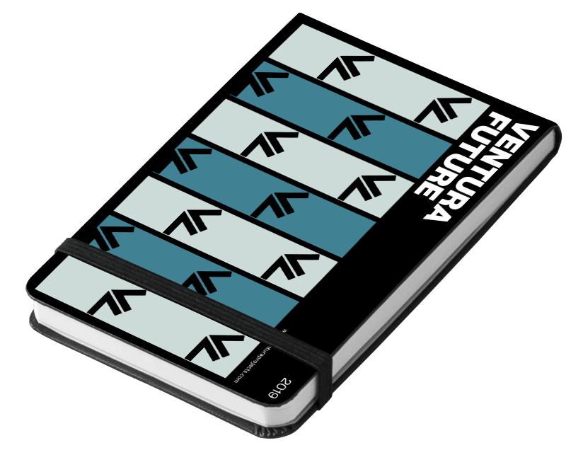
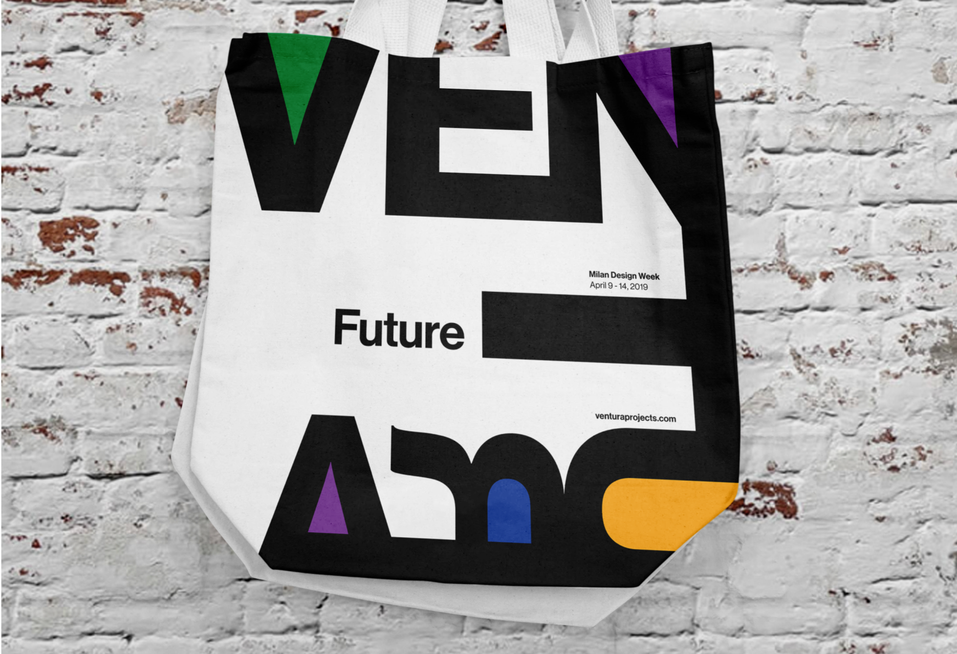
Through research on Ventura Future, the team first settled on posters, sketchbooks, and tote bags for graphical assets as it was believed they provided the best oppurtunity to promote and facilitate the event. Posters would serve as the pre-event touch point to invite attendees while totebags and sketchbooks would act as post-event takaways that would continue to promote Ventura Future even after the event's conclusion.
Graphical Experimentation
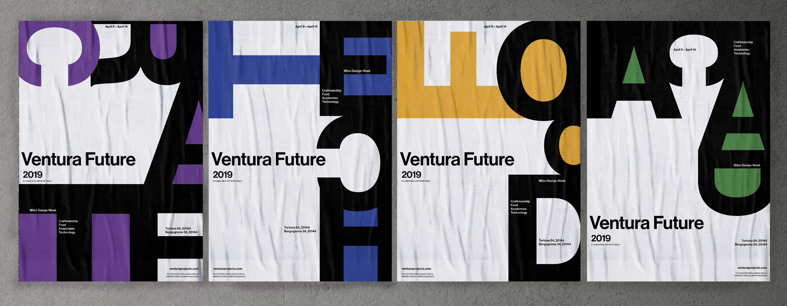
Final Graphic Assets
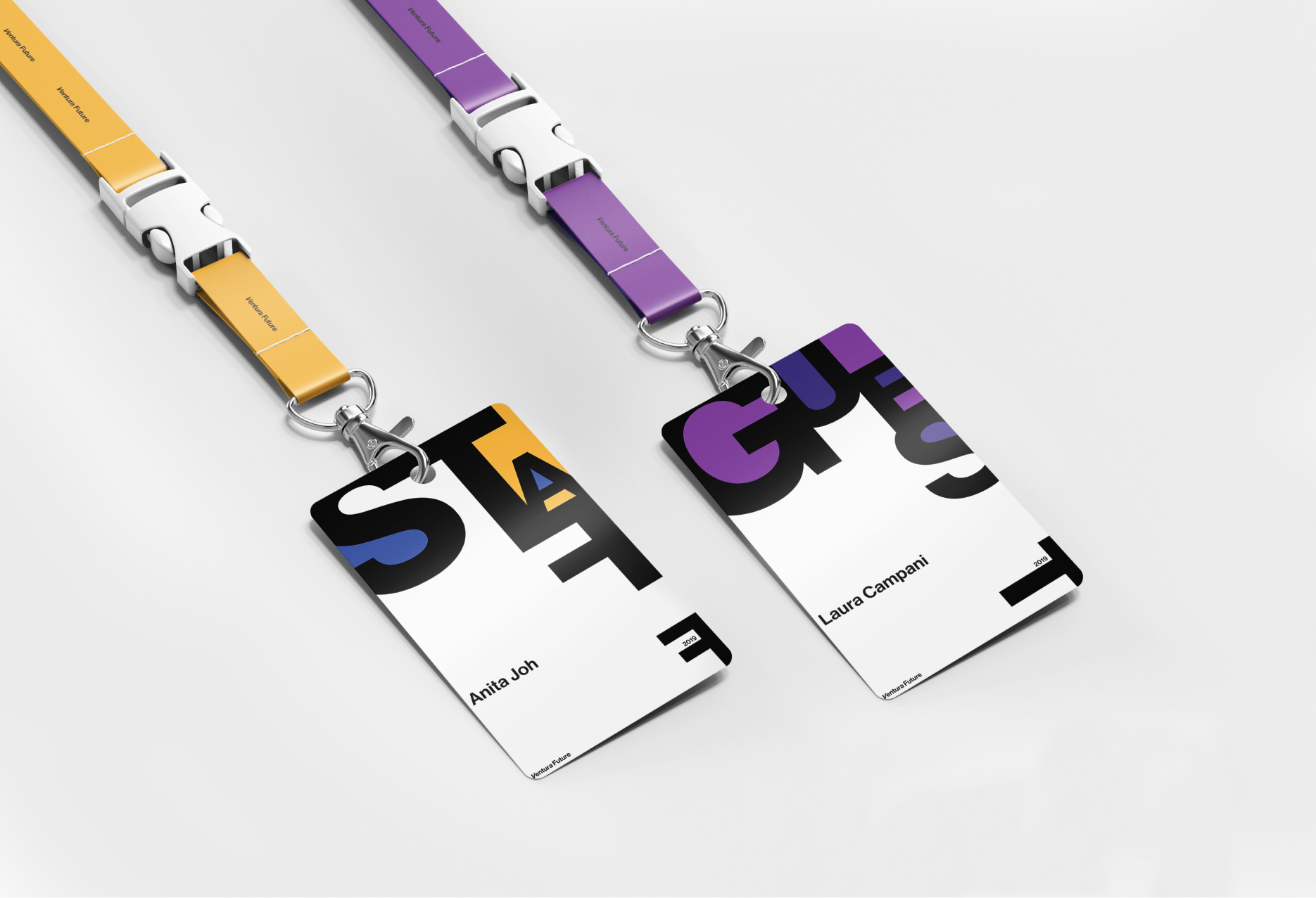
Building from the 2nd poster experimentation created by me, a final direction was chosen that featured reversible figure-ground motifs created with varying scale and orientation of type. This direction featured a system that categorized each different theme of the event (craftsmanship, food, technology and academies) with separate colours that were used to fill in spaces within enlargened type.
Violet represents craft, yellow represents food, blue represents technology and green represents academies. The remaining negative spaces would then feature important information regarding the event. As a final change, sketchbooks were replaced with nametags as it was determined that they provided a bigger impact as a during event touchpoint that would help in distinguishing guests and staff members.
Microsite Implementation
When researching and taking into consideration the scope of how/what users would interact with the microsite, it was decided that the focus would be using it as a platform to promote the event for prospective designers. This was done as the event itself relies on incoming applications for it to be run; without designers, there is no Ventura Future. Thus, the site acts as a pre-purchase touchpoint detailing the benefits applying designers will receive using data from the previous year’s event.
Developing the Form
While we first aimed to translate the structure in our graphic assets to digital, it became clear as time progressed that this was not possible; a pivot in our approach had to be made. For this new platform, the key principles of reversible figure-ground and energy through scale and orientation was maintained with previous elements being dropped.
The site itself is an infinite scroll that leads the user through content regarding Ventura Future before reaching the end where they will be prompted to register for the event. While our team worked closely together in refining eachother's work, my main role lay in helping to develop copy for the intro and events as well as forming the interactions within the prototype and assisting David with After Effects.

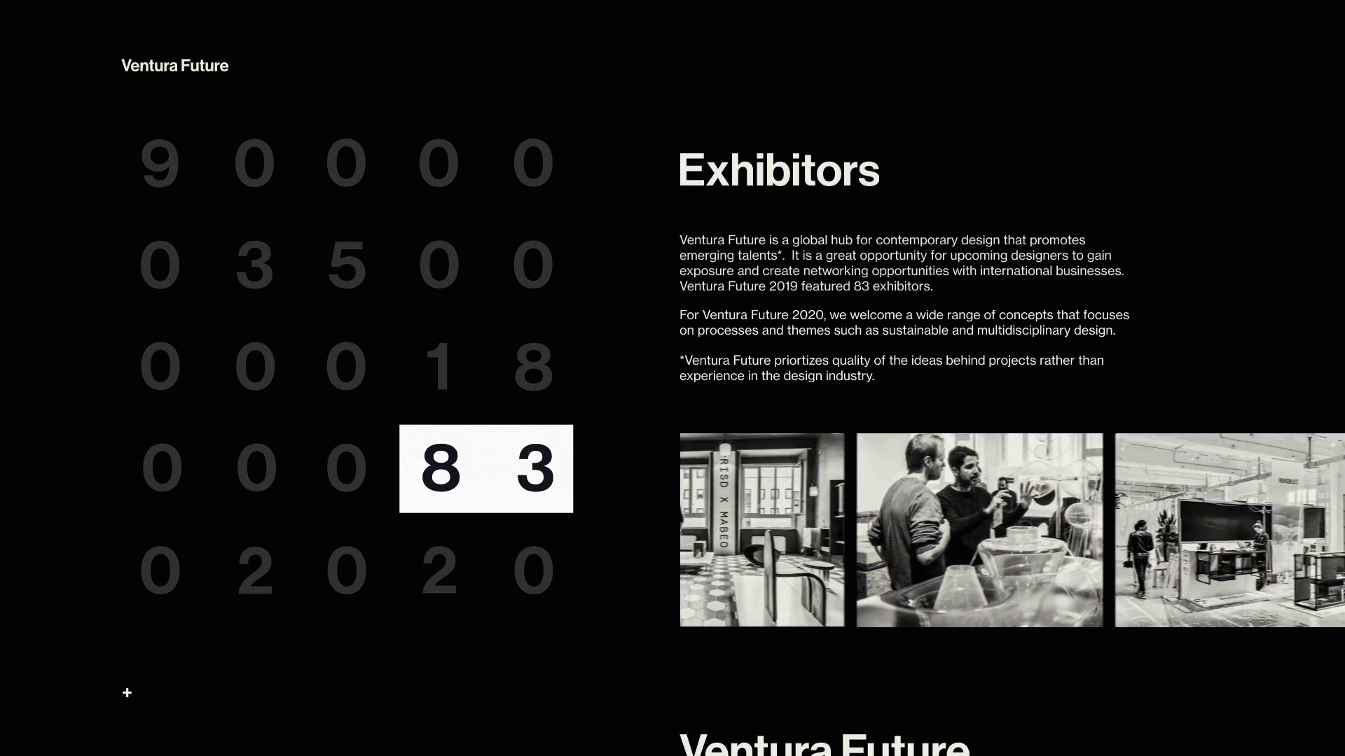
Loading + Landing
Decoding numbers play upon entering the site indicating the site loading. Final numbers represent different aspects of Ventura Future in the number of visitors, academies, exhibitors, and the year 2020

Content Page
White bar acts as figure ground that shows the progress and location of the user as they scroll through
Application Page Transition
Quotes from previous year provide supporting facts to encourage applications before bringing them to the final page
Full Demo
Below is the full walkthrough of the Ventura Future microsite.
My Final Thoughts
Through these hectic 5 weeks, there was definitely a lot to I had to take away through the studying, research, and final development phases of the project. Being able to learn through the works of Dan Friedman revealed the intricacies behind his vision of Radical Modernism and opened my eyes to how key design principles can truly frame and drive an art direction.
By fully understanding how and why these principles are implemented, we as designers can create better assets that speak to different contexts. In the case of this project, I've learned that being able to understand the process of past designers can help develop our own process, and while graphic fundamentals are important to interaction design, the translation between both is not a simple one-to-one equation.